I have loved using my Samsung Galaxy s5 since I got it last September. It was very usable, featuring dark screens with white letters that were easy to read and didn't use much battery power. Things were arranged in meaningful ways to make daily life just a bit easier.
I guess we didn't want that.
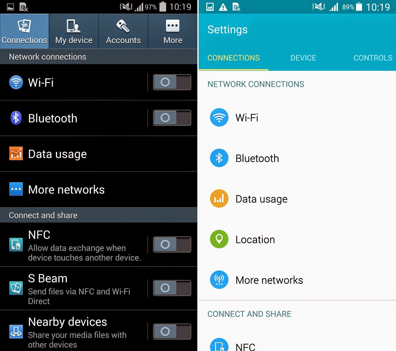
After Friday's "upgrade" the phone is a complete mess. Everything, including the text keyboard is smaller, flat, featureless, and on a white background. There are no options to change the default colors and we are stuck with Google's hideous 'material interface'.
The only thing I can figure is there is a twelve-year-old somewhere designing this stuff with no regard to functionality because it is a major step backwards in usability.
 |
| Old dialer on the left, new on the right. |
 |
| Old settings screen vs. new one. |
I'm not posting my contacts screen for privacy reasons, but where there were once large square photos of my contacts making it easier to dial with my presbyopia, there are now minuscule circular photos that I can't recognize without my reading glasses.
All these white pixels are draining my battery more quickly than the black screens. Everything is tiny, flat, and white. Several functions are gone, replaced with less useful ones.
The list goes on and on. Why anyone would think this interface is better than what we had is beyond me.
If the phone looked like this when I was shopping for phones I would not have purchased it.
Just say "no" to lollipop.
.
No comments:
Post a Comment